One of the things that makes BarnManager unique is our approach to product design and development. We are led by our users, not our assumptions. The following post is a deeper look at the way we worked with the User Experience experts at Fresh Tilled Soil to gain new perspective and build a better BarnManager. I hope that you like this behind the scenes look at our process. If you would like to provide feedback or be interviewed for current or future feature development, feel free to send me an e-mail at nicole@barnmanager.com. This post was originally published on Medium – Enjoy!
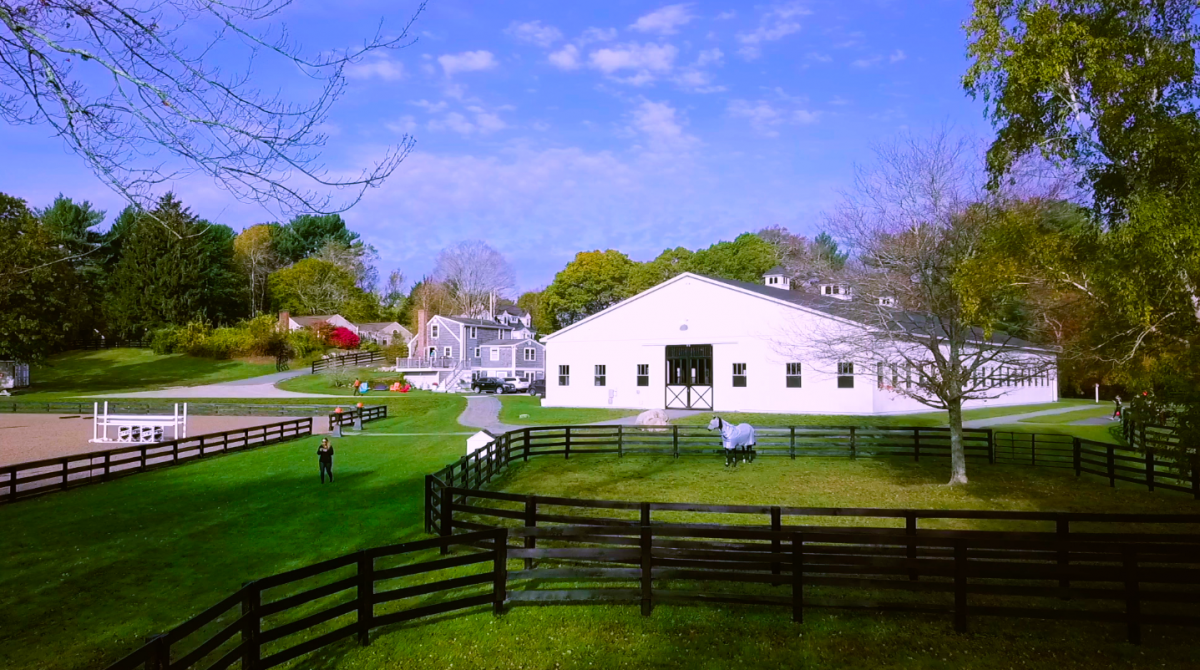
Lovelight Farm
The BarnManager Story
Managing a horse barn is a labor of love with many moving parts. It requires an endless paper trail of health records for the horses under your care, white boards to communicate with barn staff, and calendars to keep track of appointments, training, and competitions. The majority of people involved in horse management are not happy with the traditional methods of keeping it all organized and need a new solution.
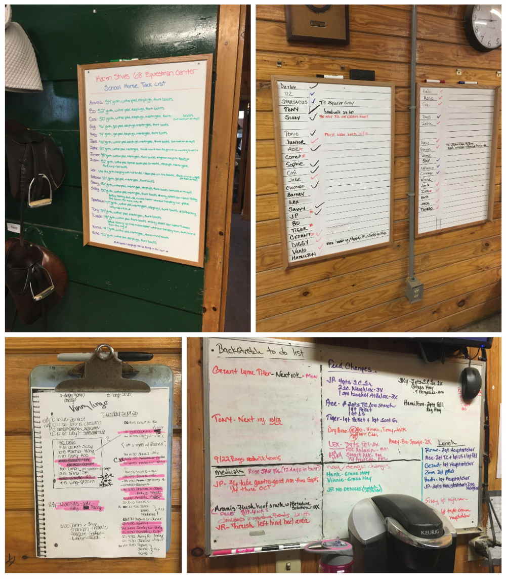
Most barns manage their horses’ schedules and information with a combination of whiteboards and notebooks
BarnManager is an application that was created by barn managers for barn managers to improve communication, sharing, and scheduling across the myriad of roles involved in the care of horses including horse owners, grooms, barn managers, trainers, riders, and veterinarians. It’s a tool that supports traditional horsemanship and enables users to spend more time doing what they love — working with horses.
Building a Better BarnManager
With a growing customer base, BarnManager was ready to invest in making improvements to the initial version of their application. Owner and president Nicole Lakin engaged Fresh Tilled Soil in a project to:
- Improve the overall product UI/UX,
- Increase user adoption, satisfaction, and “stickiness”,
- Optimize for mobile access, and
- Re-engineer and improve the application’s code base
User Research — Getting To Know Your Customer’s Customers
For UX practitioners the real work hardly ever happens in the office. You need to interact directly with your client and your client’s customers in the environments where those people interact with the tools and products being designed for them. You have to see how they work and what they are doing every single day. You can’t make judgements from a desk or from behind a screen. This is particularly important when technology is not the center of your customers’ world — which is certainly the case in a horse barn.
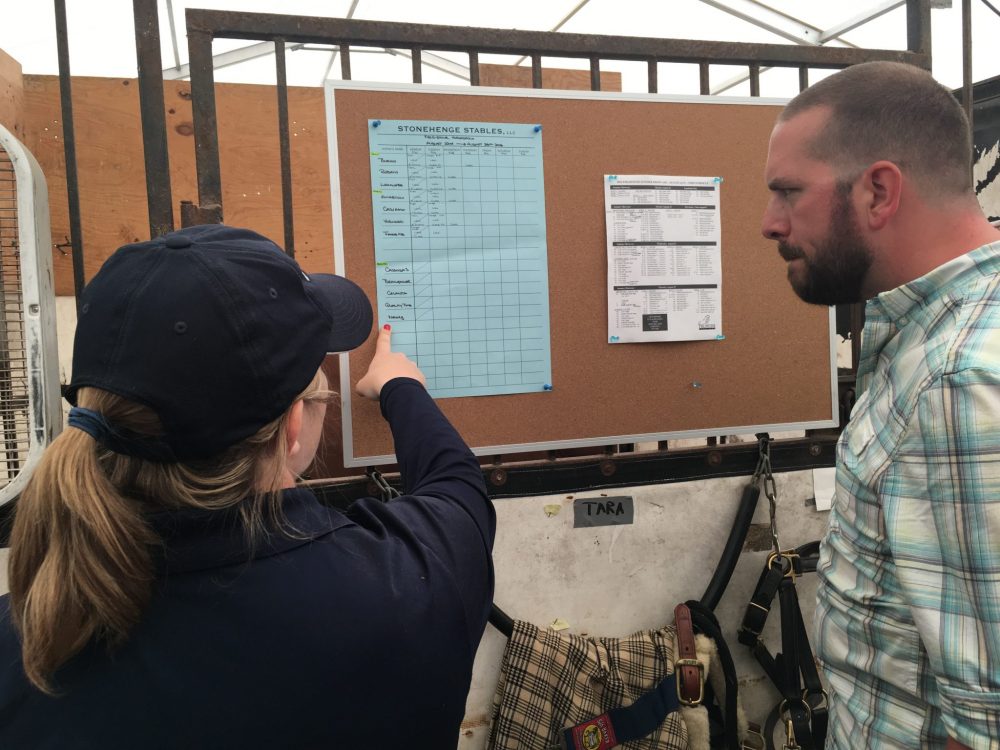
A member of the barn staff explains how they manage their horses’ schedules to our team
As luck would have it, our team was able to attend a horse competition just days before our project was scheduled to kick off. Many of BarnManager’s customers and users were in attendance, so it was the perfect opportunity to get to know them in their environment. Over the course of our interviews with barn managers, trainers, owners, riders, and veterinarians, we were able to identify a number of critical pain points:
- Keeping medical records in one place. Often, a horse’s medical history isn’t kept on-hand or in an organized fashion, which presents a challenge for veterinarians who may be seeing a horse for the first time. And it’s not just about access but also appropriate access. Not everyone can or should be able to see a horse’s complete medical history.
- Lack of communication. Keeping track of all information about a horse is very hard to do, and most barns have a variety of places where this information is kept. Everyone involved in keeping a horse healthy and competition-ready needs to be aware of and up-to-date on what has happened and when. Has the horse been fed today? Have they been exercised? How did they respond? And more. Most of this is accomplished today via handwritten notes and on whiteboards posted throughout the barn — very inefficient, not portable, and impossible to share.
- It’s all about the schedule. A horse’s calendar and schedule is ALWAYS changing. As are those of the barn staff, veterinarians, and others. Barn managers need a centralized view to keep track of everything and avoid missing key dates.
- Mobile is a must. Most of BarnManager’s users are very mobile. They spend more time in the barn, in the stables, and in the fields with the horses than they do in front of a screen.
Our site visits were so engaging that we even put together a little video about our visit to Lovelight Farm.
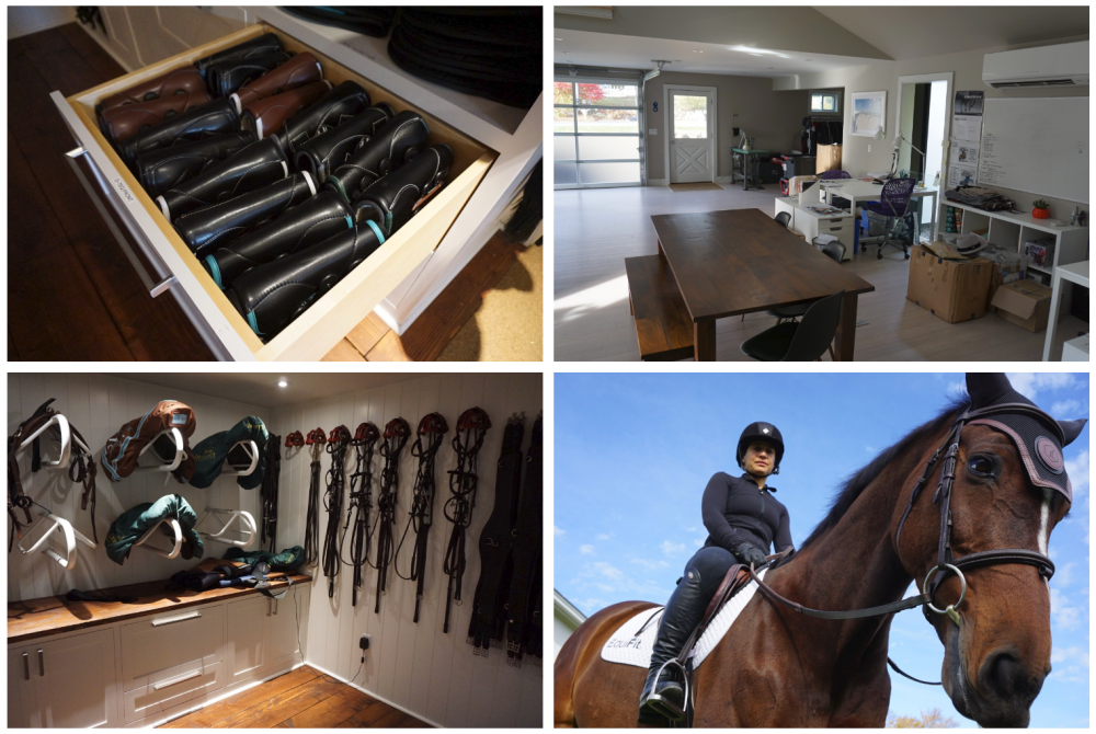
Visiting with EquiFit Founder and President Alexandra Cherubini at Lovelight Farm in Marshfield, MA
Mapping The User Experience
Experience mapping is one of the most effective ways to highlight user insights and improvement opportunities within any type of project. They are a crucial part of the strategy and design process and a foolproof way to illustrate all the different touch points that a user interacts with in any given experience. We worked with BarnManger to create a detailed User Experience Map for their users.
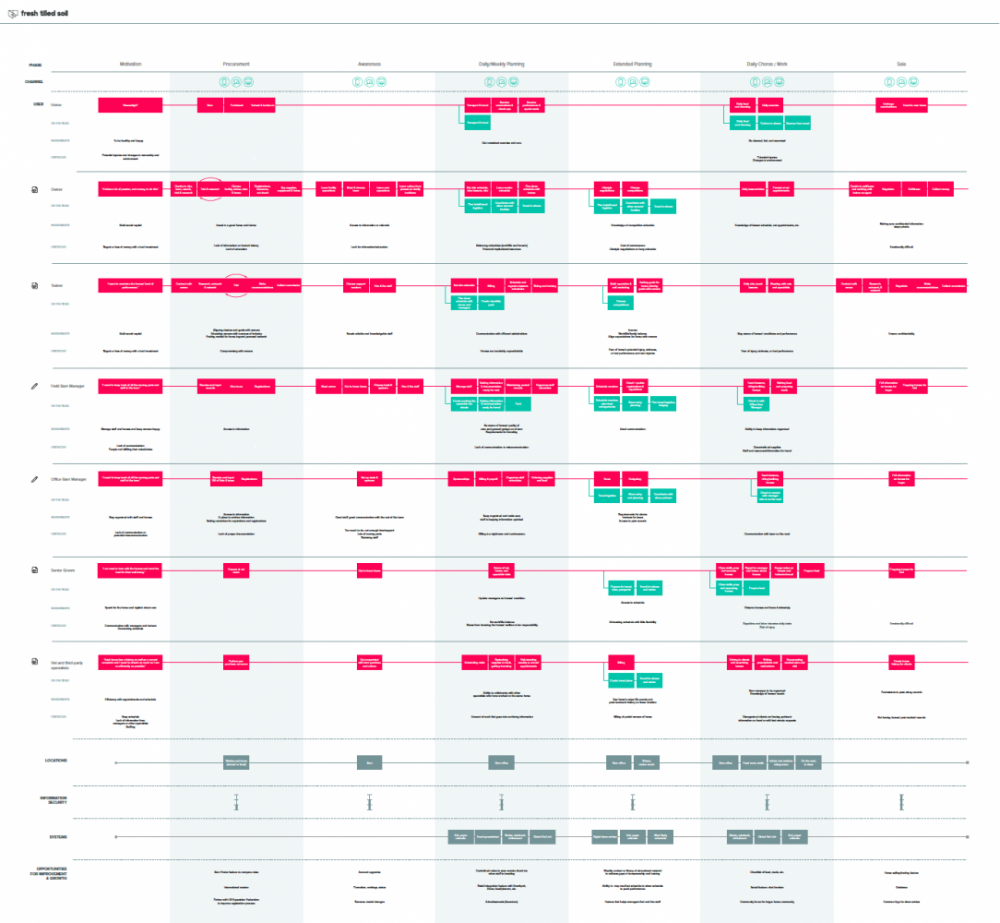
User Experience Map for BarnManger
Building a Product Roadmap
BarnManager had a lot of great ideas for improvements to the application, and many more surfaced in our user interviews. But those ideas needed a process and ultimately an artifact to help them focus on the big picture and establish a path to fulfill their product vision. With user research and experience maps clearly defined, we were ready to take the team through a roadmapping process to help them focus, align, prioritize, and ultimately paint a picture of a brighter future for their customers.
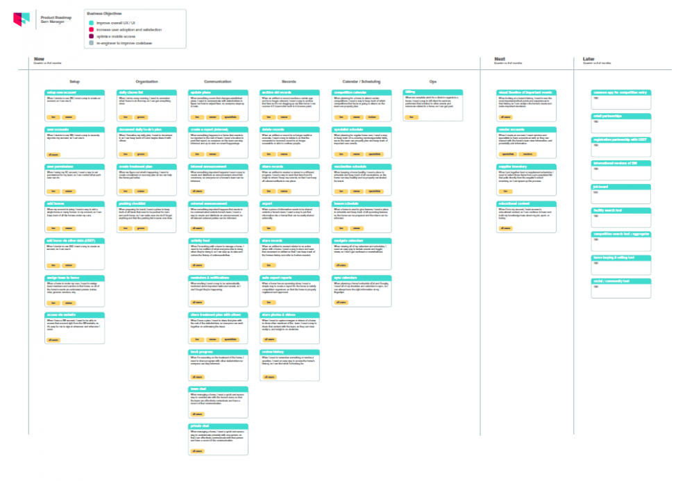
BarnManager product roadmap
Wireframes and Prototyping
Getting your design right early pays off: what costs $1 to fix in the requirements stage costs $3–6 to fix in design, $10 to fix in coding, and $40+ to fix after release*. Rapid prototyping helps you answer important questions quickly and inexpensively. Fresh Tilled Soil developed mobile and web-based clickable prototypes for further user testing and concept validation. These prototypes allowed us to present a simple and focused feature set meant to address users’ pain points and the workflows identified in our interviews and observations.
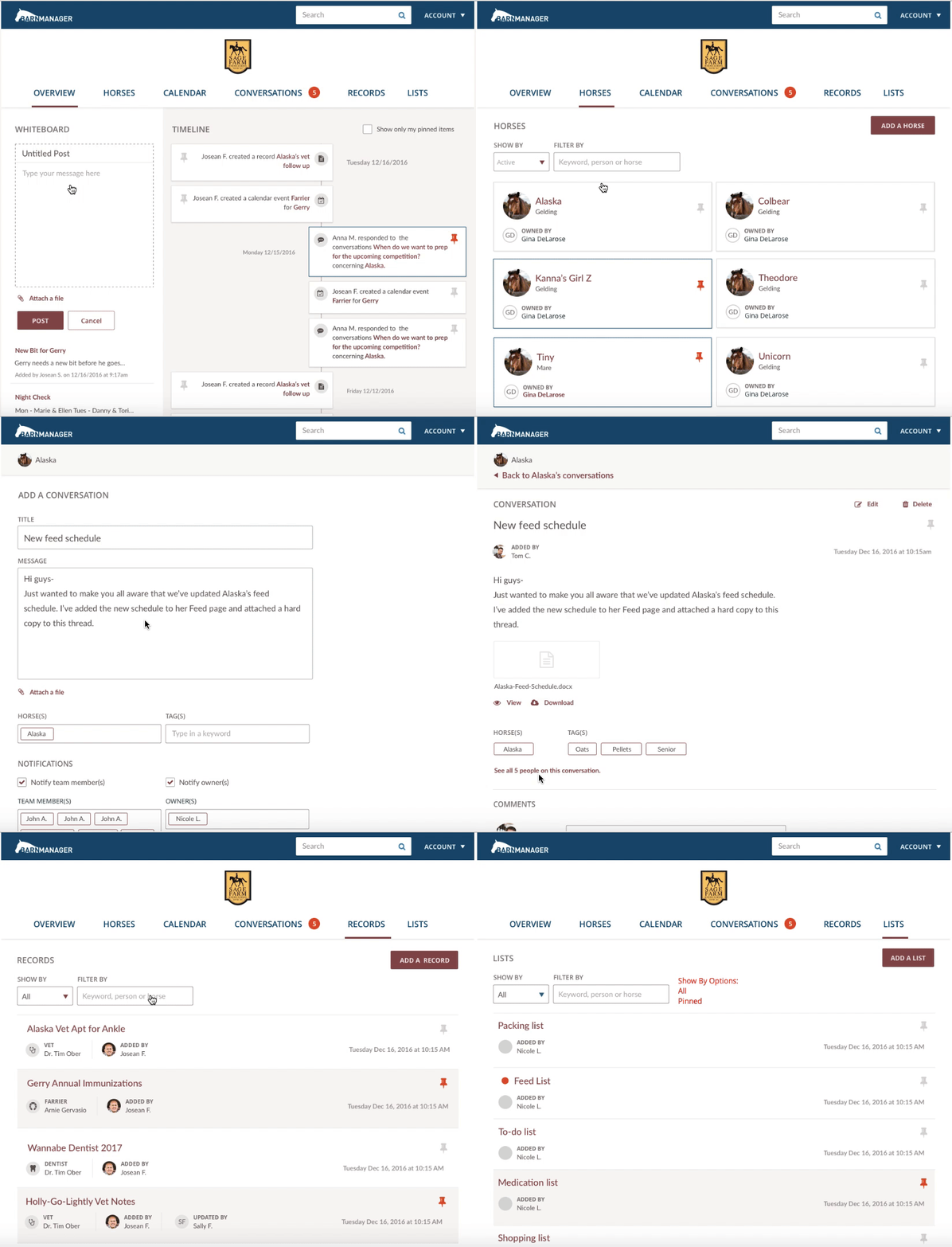
Web app prototype and testing using InVision
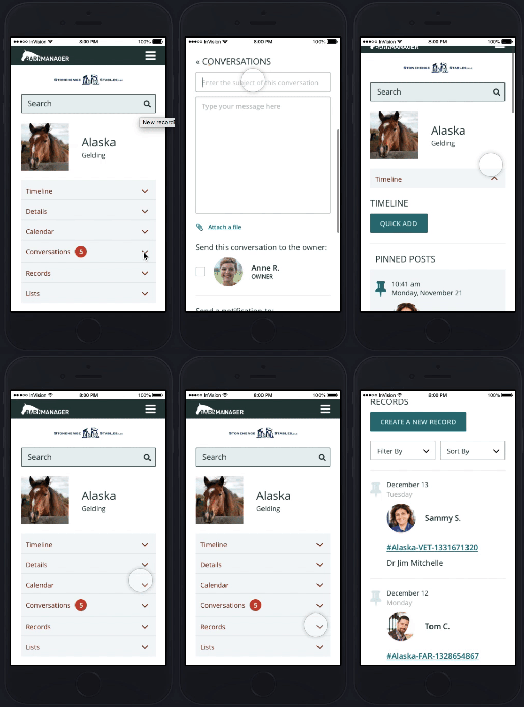
Mobile app prototype and testing
Mobile design
BarnManager’s initial product release didn’t include a dedicated mobile experience, yet their users spend most of their time away from a desk and screen. So designing a beautiful mobile experience was high on the list of goals for the project.
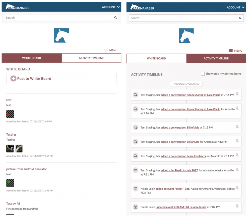
Mobile app screens for White Board and Activity Timeline
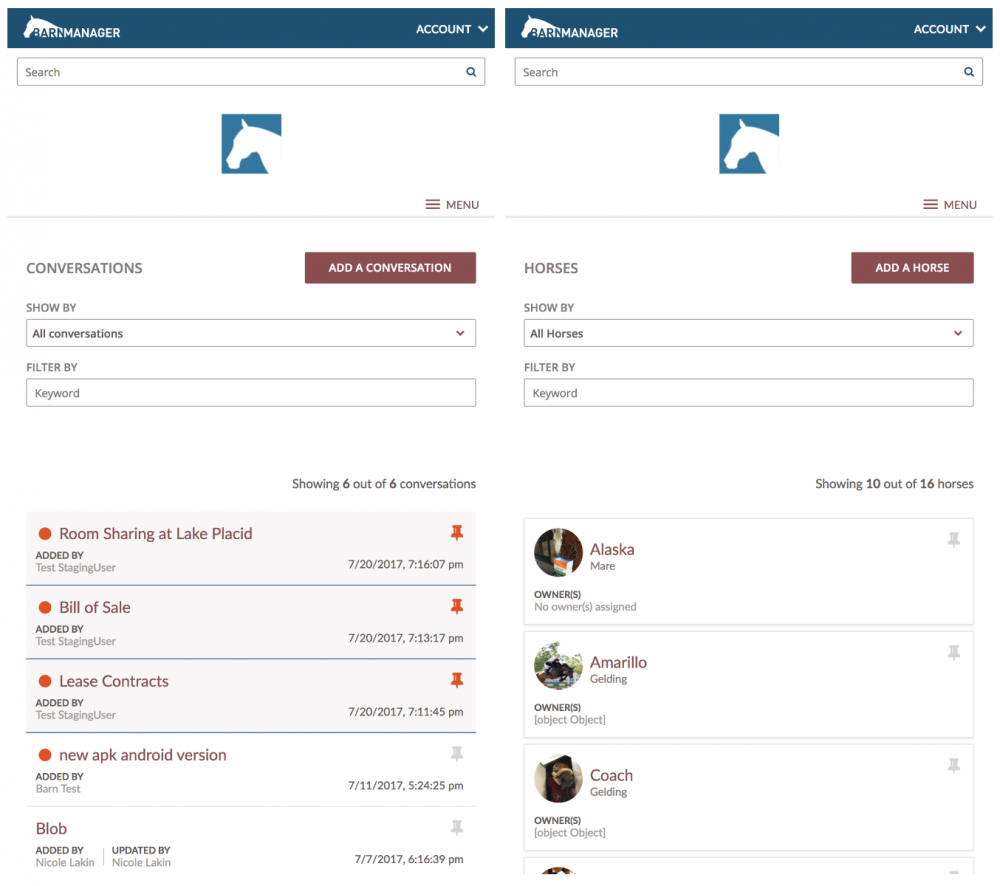
Mobile app screens for Calendar, Conversations, and Horses
Web Application Design
We also delivered a fresh new design and user flow for the web application version of the product which included improvements to the application’s code base.
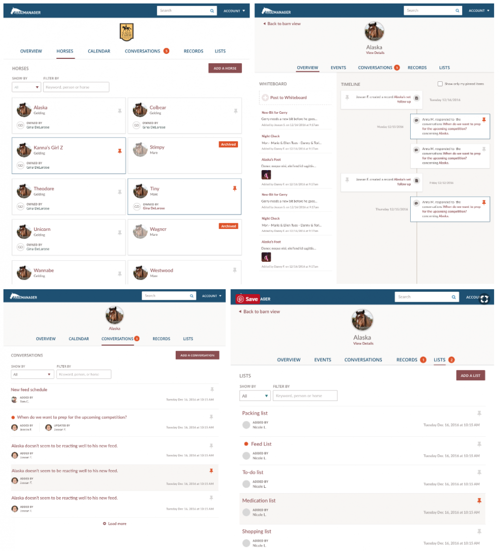
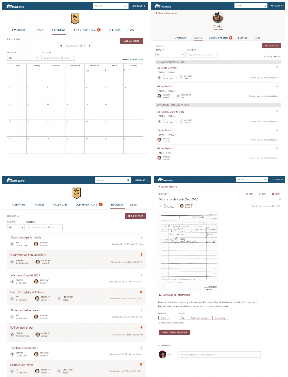
Website Design
Once the main project wrapped up, the BarnManager team realized the company’s website needed a refresh as well in order to better match the new experience and interface that was to come for the core product. We worked with Nicole to come up with a design that could be implemented within a very reasonable amount of time and budget. Everyone wanted to keep the focus on the product work and not spend too many resources on the website. So here’s what we came up with.
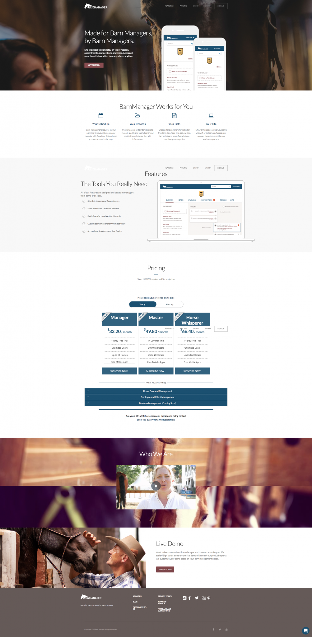
New BarnManager website design
The Client Experience
“Working with the team at Fresh Tilled Soil enabled us to bring fresh eyes to the challenges of barn management. The team really embraced getting to know the people that we were trying to serve and the challenges that they face on a daily basis and helped us to reframe them by bringing in new perspectives, backgrounds, and approaches. Working through their discovery and design processes helped us to achieve new levels of insight into what our customers were telling us. And what we have learned has been invaluable.
Every time we do a demo with a potential new user and they tell us that BarnManager is far more user-friendly and clearly beneficial than the other software that they have looked at, we know that this is the result of the work that we did with Fresh Tilled Soil.” — Nicole Lakin, Founder/CEO BarnManager
